Where Designers Actually Find Stock Photos
Finding stock photography shouldn’t require hours of scrolling or compromise. Most stock libraries are built for volume, not taste—resulting in imagery that feels generic, overproduced, or visually loud.
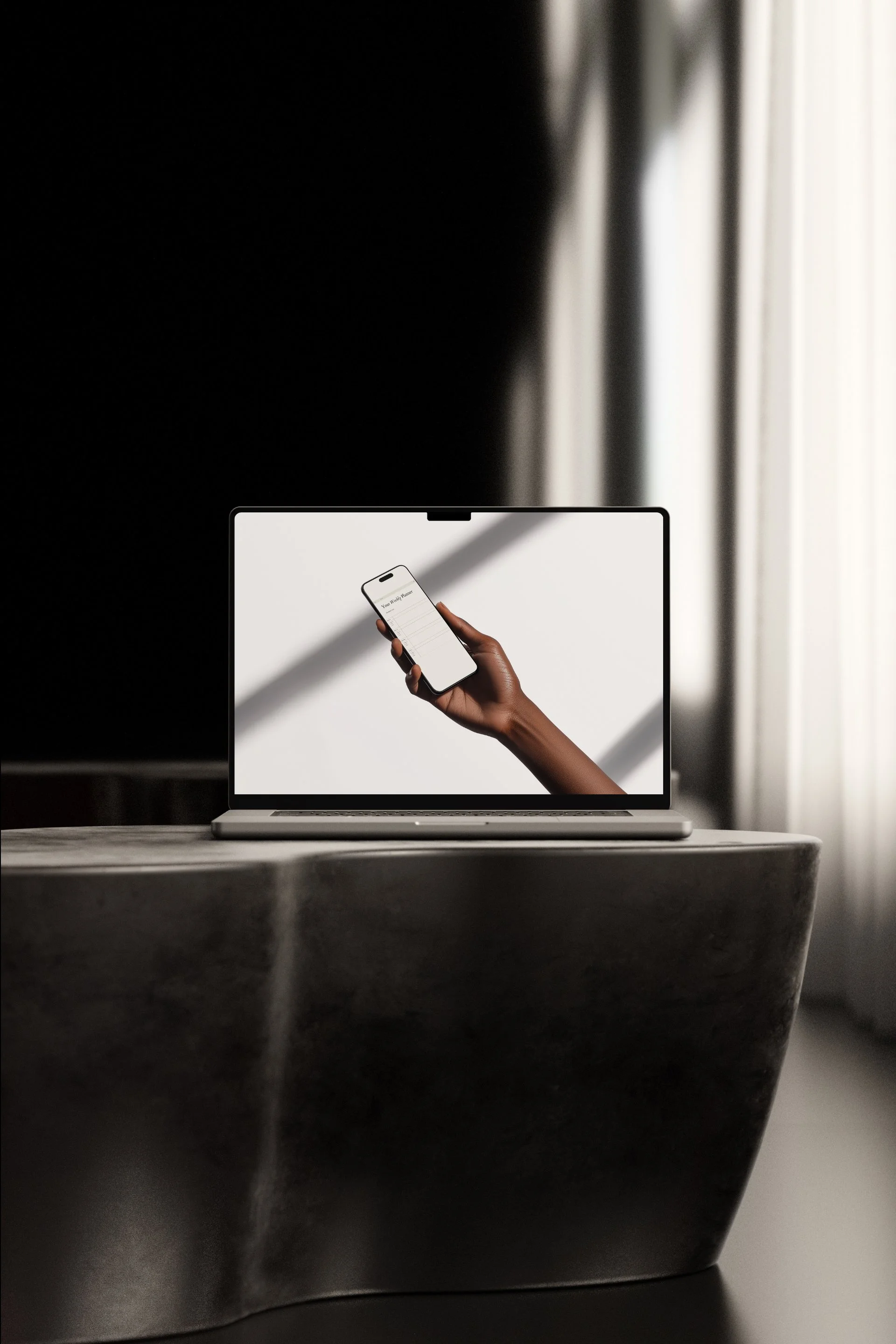
Designers on brand projects need restraint and purposeful visuals—editorial photos with clear composition, consistent tone, natural light, subtle styling, and space beside type. Prefer real-life scenes over staged stock. Curated studios and boutique image libraries (pre-vetted aesthetics, commercial licenses) speed concepting and approvals and offer bespoke shoots and exclusive assets that elevate brand-forward imagery.
→ Also Read: Quiet Visual Resources for Brand-First Designers
For creative teams, the advantages are clear:
Consistent Visual Language: curated collections maintain a unified tone and palette across campaigns and touchpoints.
From Faster Workflows: to Design Systems That Reduce Creative Friction to pre-selected assets that reduce search time and simplify stakeholder sign-off.
Legal Clarity: commercial-ready licensing removes uncertainty and protects brand use.
Customization and Exclusivity: partnerships enable tailored shoots and unique content that differentiate a brand.
Higher Production Value: boutique libraries prioritize art direction and craft, aligning images with strategic design goals.
Integrating curated studios into your asset strategy transforms images from mere placeholders into strategic design elements—supporting cohesive branding, accelerating delivery, and elevating the perceived value of creative work.
This post contains affiliate links. If you purchase through these links, I may earn a small commission at no additional cost to you.
Why Good Stock Photography Is Hard to Find
High-quality imagery is hard to find because it avoids trends and gimmicks. Editorial composition, natural light, careful framing, and subtle subjects often underperform on mass stock platforms. Those sites favor broad, searchable, high-volume images over nuanced, brand-specific visuals, leaving many technically competent but moodless options.
Consequently, designers end up spending disproportionate time sifting through thousands of near-matches, sacrificing creative energy for curation. They compromise by selecting images that are “good enough” rather than true extensions of their brand voice—neutral faces, generic scenes, and safe color palettes that dilute a project’s personality. This filtering workload distracts from design strategy and slows the production process.
What brands and studios need isn’t another stock library, but sharper selection: editorially minded collections, tighter curation, and smarter metadata that surfaces images aligned with mood, context, and narrative. Better editing reduces noise, accelerates decision-making, and restores design time to designers—so visual choices can be deliberate, distinctive, and on-brand.
Why Designers Gravitate Toward Curated Studios
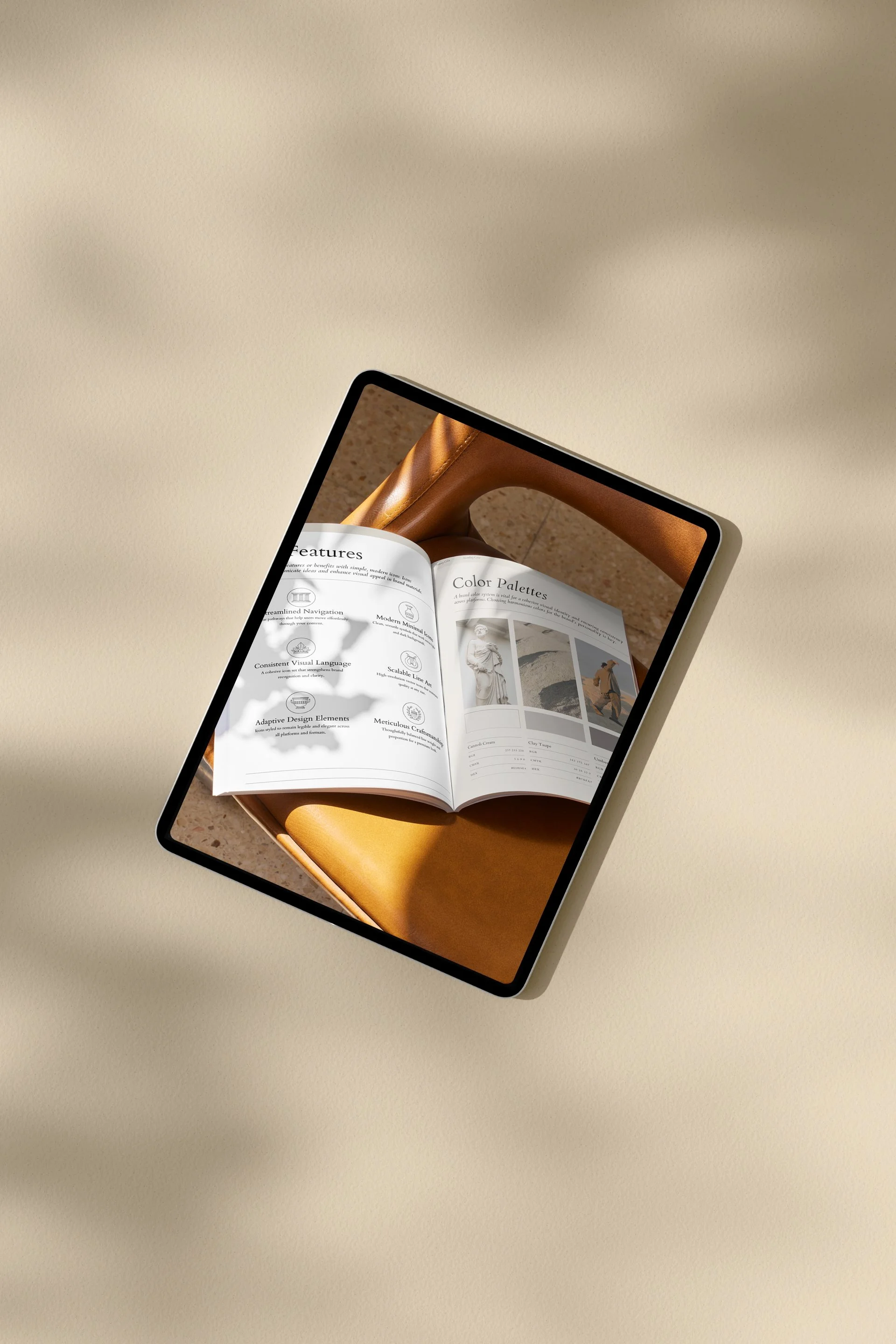
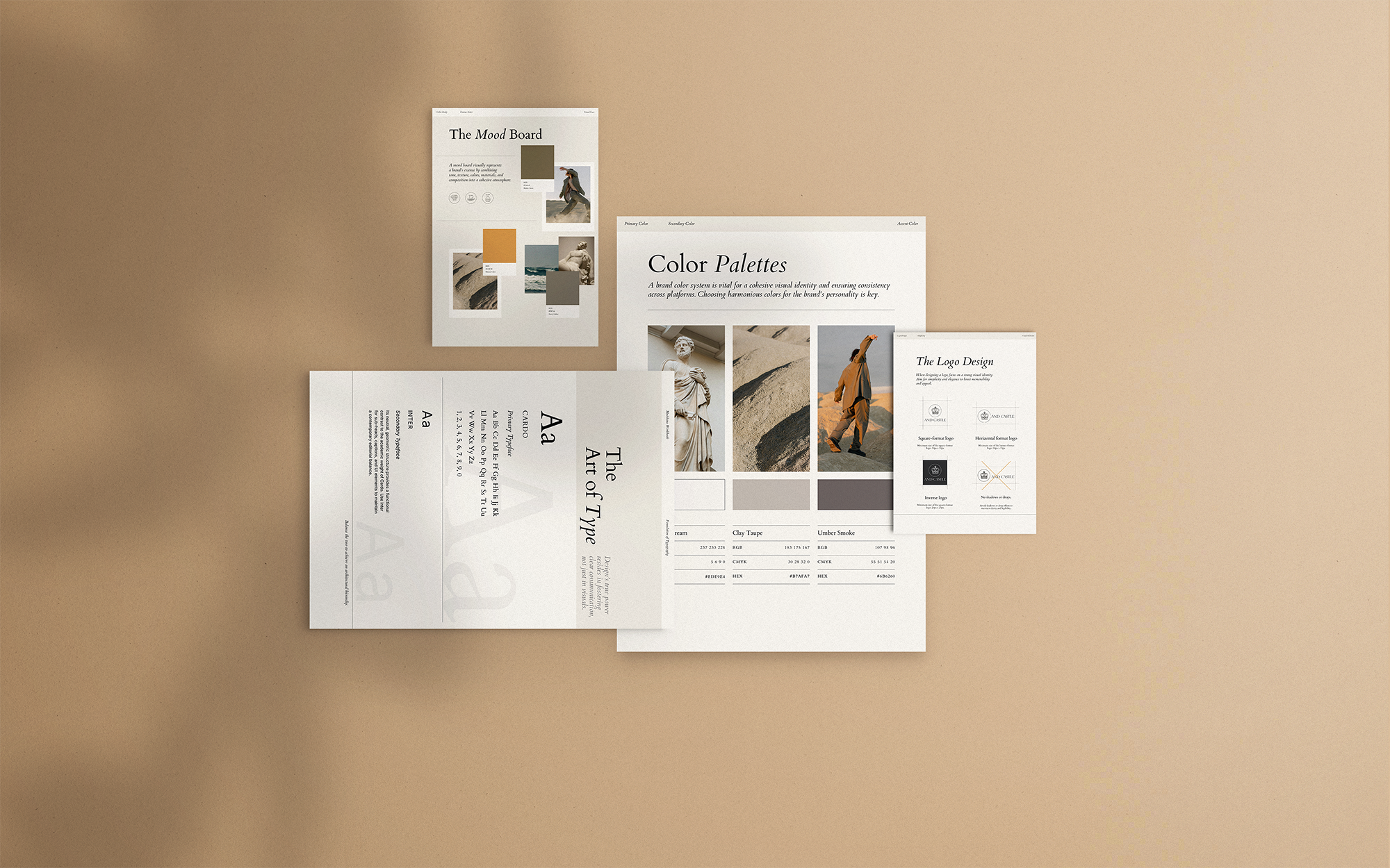
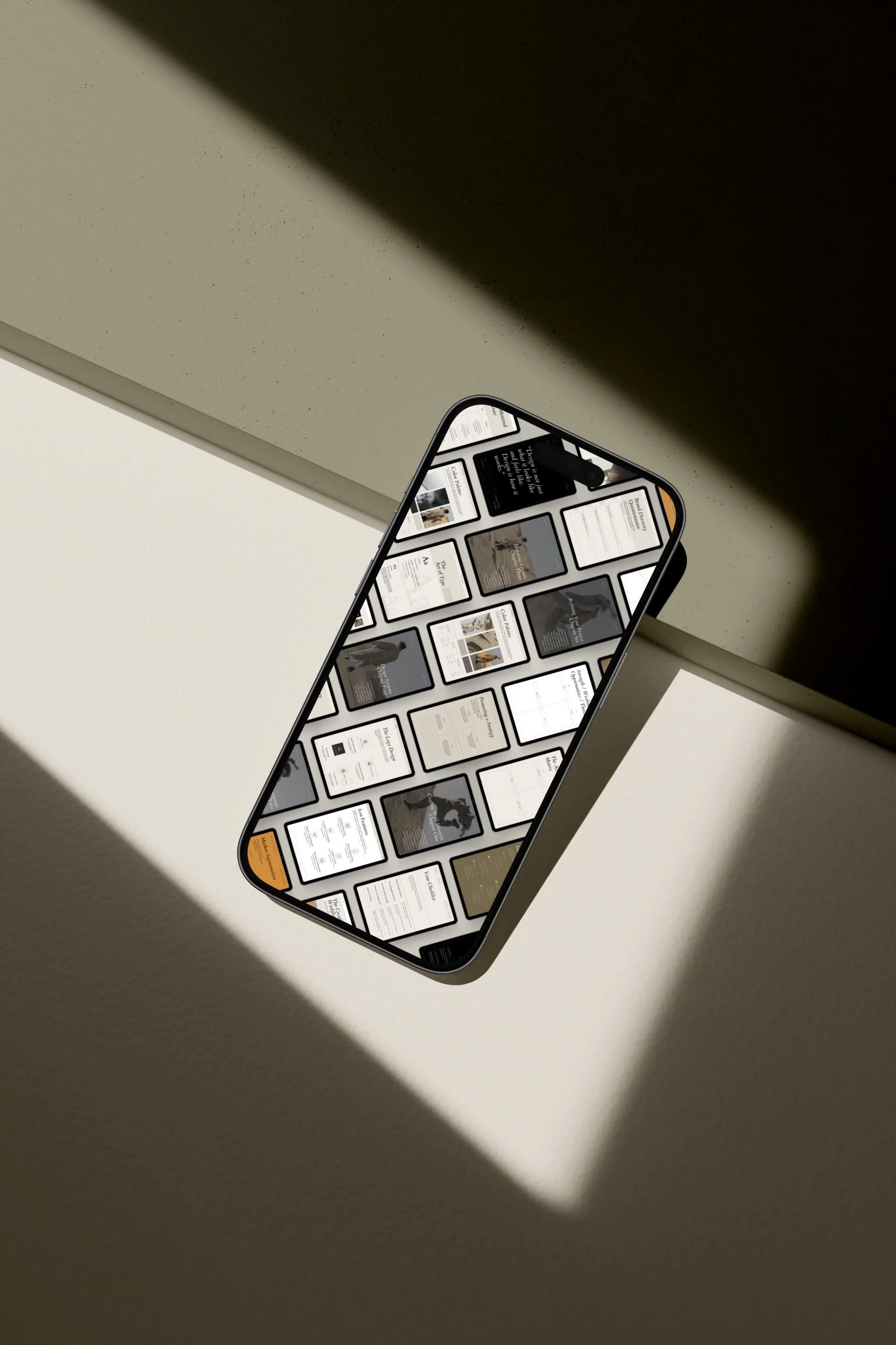
Many designers now use small, editorial-led studios that treat stock photography like publishing. Curated studios favor cohesion and storytelling over quantity, keeping a consistent visual language to strengthen brand identity. Thoughtfully edited selections reduce decision fatigue and make choosing faster and more intentional.
A Curated Studio Designers Actually Use
MOYO Studio
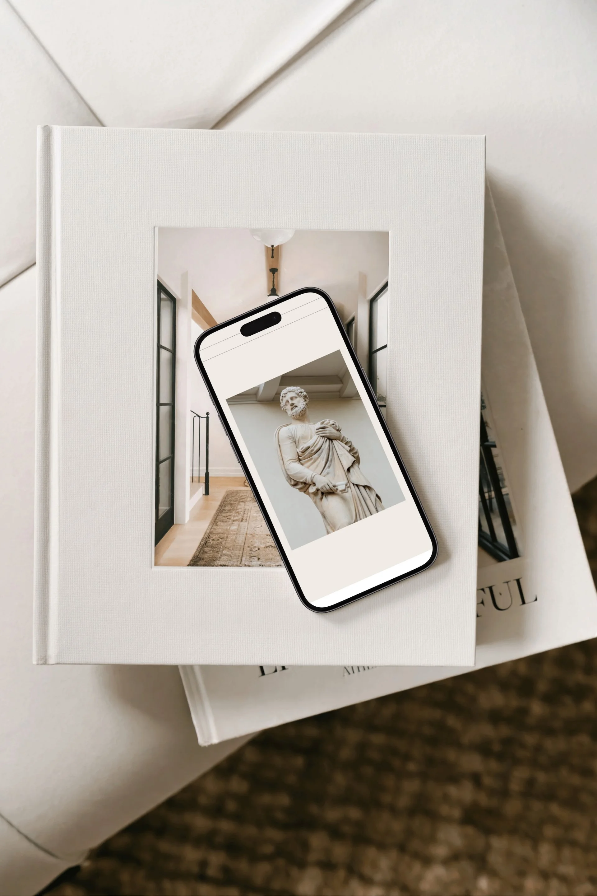
An editorial-led stock photography studio offering thoughtfully composed, art-directed imagery crafted for brand-forward projects. MOYO’s collections feel closer to high-end magazine editorials than to traditional stock libraries, prioritizing visual storytelling and cohesive aesthetic direction.
→ Find High-Quality Imagery — View on Moyo Studio
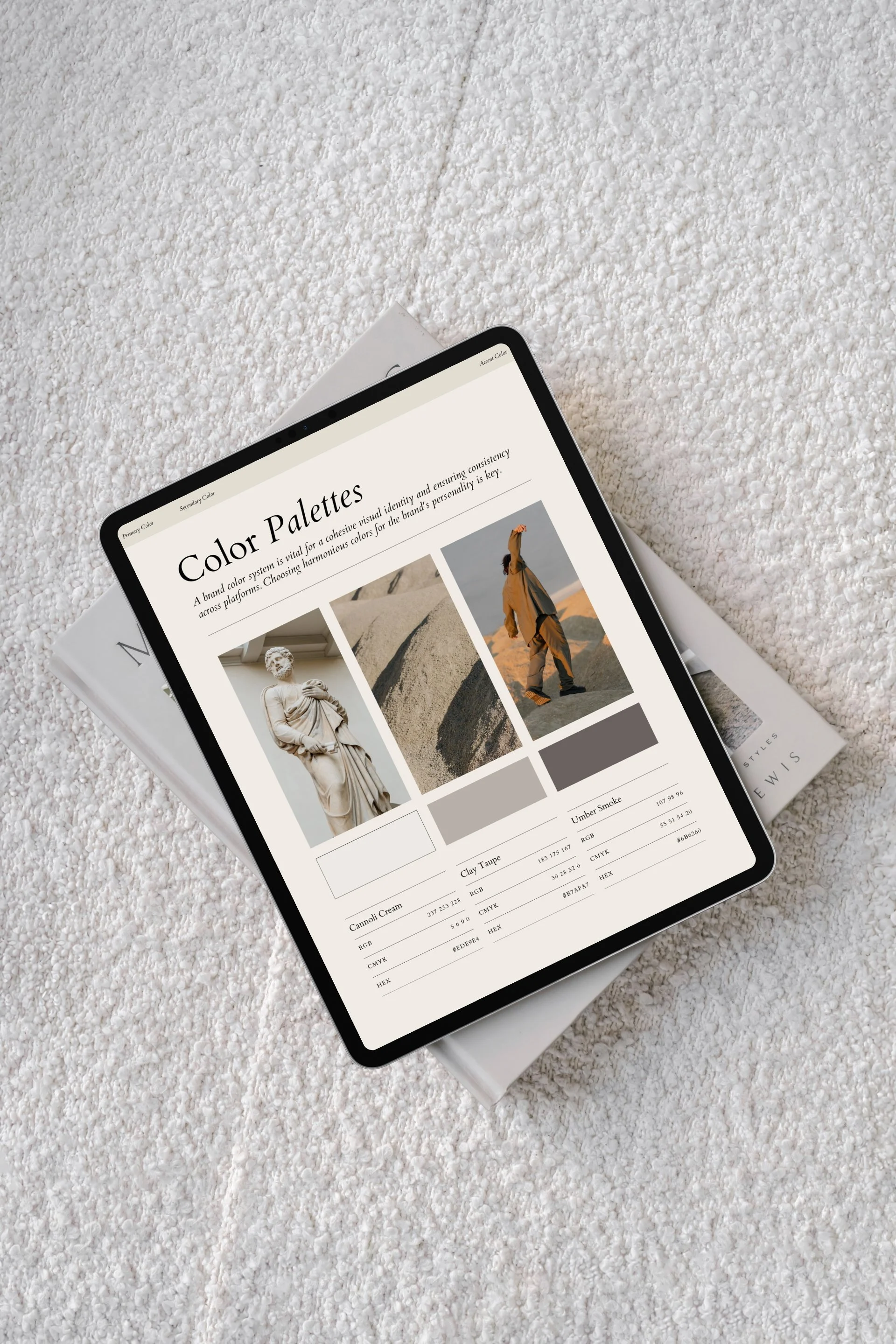
MOYO Studio is especially valuable for projects that require editorial, design-aware photography; meticulous art direction and a consistently evocative visual mood; and imagery that integrates effortlessly into layouts. Its collections are crafted with a designer’s needs in mind, prioritizing visual cohesion, versatile compositions, and subtle tonal control so images feel at home within editorial spreads, websites, and branded materials.
Because the work is released as cohesive, thoughtfully curated collections, designers spend less time searching and more time composing intentional, polished pages with confidence. Ready-to-use sets reduce the friction of asset selection, enabling faster iteration and a sharper focus on storytelling and layout, while maintaining a high standard of aesthetic consistency across every project.
How Designers Use Editorial Stock in Practice
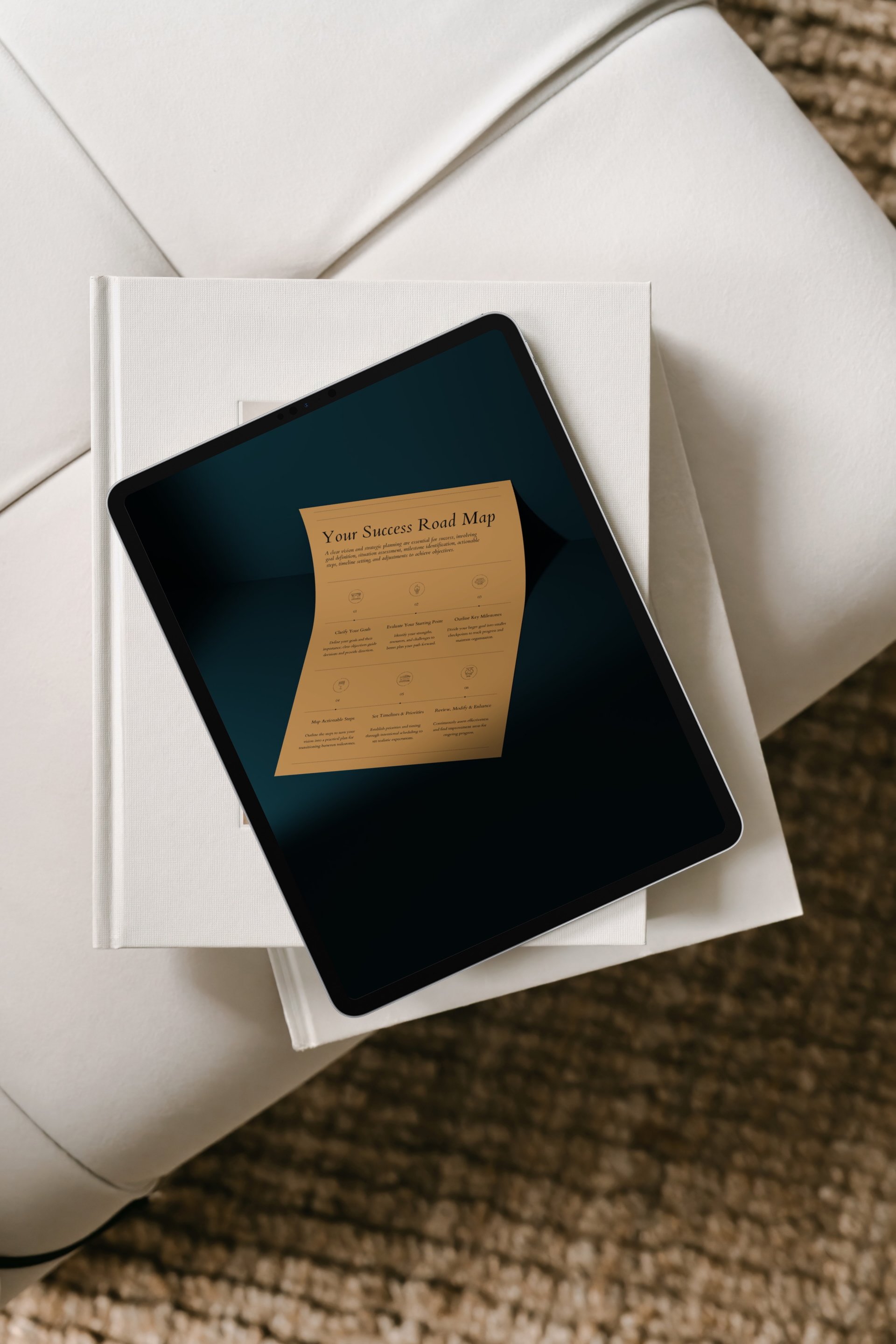
Editorial stock should support the overall structure and intent, not merely serve as decorative embellishment: choose imagery, type, and layout that clarify hierarchy, reinforce meaning, and guide the reader’s attention; prioritize assets that communicate function and context over purely ornamental elements; ensure consistency in tone, scale, and placement so each visual choice advances the message and improves usability rather than distracting from it.
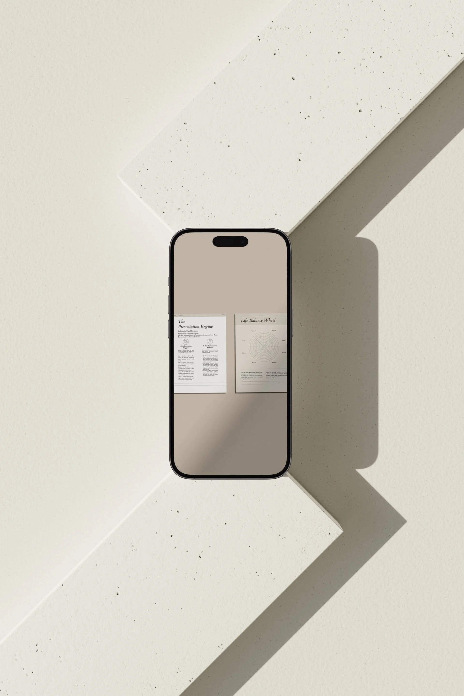
Thoughtful designers often employ carefully curated imagery to establish tone on landing pages, create atmosphere within editorial layouts, and support brand narratives without unnecessary overstatement or distraction. Because the photography is already art-directed, it pairs naturally with strong typography, disciplined grid systems, and generous white space—allowing the overall design to breathe, the hierarchy to remain clear, and the message to be read easily and with intent.
Choosing Visual Resources You Can Rely On Long-Term
The most useful visual tools are the ones you can return to repeatedly without friction, tools that feel intuitive and dependable each time you open them. When a system is familiar, your creative energy goes toward refining ideas instead of relearning layouts or hunting for assets; that economy of attention is what makes consistent output possible. Consistency matters more than novelty—especially when building sustainable creative systems that stand the test of time—because predictable structures let you iterate faster and judge work against a stable standard.
For visual work, relying on an editorial studio like MOYO Studio makes it easier to maintain cohesion across projects, helping you avoid constantly starting from scratch and preserving a clear, unified aesthetic. A thoughtfully designed studio setup bundles templates, typographic rules, and color systems so each piece feels part of a larger body of work, while still leaving room for creative variation. The result is less friction, clearer branding, and a workflow that supports long-term creative growth.
Check Out the Website: 👉 https://www.moyo-studio.com
Final Thoughts
Good stock photography isn’t about fleeting trends—it’s about considered intention. Images chosen with purpose reflect a deeper understanding of narrative and composition, allowing visuals to communicate clearly without competing for attention. When images are selected for their editorial sensibility rather than momentary novelty, they contribute to a cohesive, lasting design language.
When designers rely on carefully curated, editorial-first studios, they spend less time sorting through distractions and more time shaping thoughtful, meaningful work. A focused library of images streamlines decision-making, freeing creative energy to refine concept, typography, and layout. The result is work that feels deliberate and aligned, not patched together from mismatched parts.
The right visual resources don’t create noise; they quietly support the creative process and elevate the final result. Subtlety and restraint in photography let the broader composition breathe, giving each element space to resonate. In that quiet support, designs achieve clarity, sophistication, and an enduring sense of purpose.