Editorial Stock Photography vs Traditional Stock: What Designers Should Know
Most stock photography isn’t designed for designers.
I used to find an image that was technically “right,” then spend time neutralizing it—cropping aggressively, softening contrast, stripping color—until it stopped announcing itself as stock. The goal wasn’t to celebrate the image. It was to make it usable.
As my work moved deeper into branding, editorial systems, and visual storytelling, that approach stopped working. Imagery wasn’t filler anymore. It was tone. Mood. Narrative structure.
That shift changed how I source photography.

Editorial Stock vs Traditional Stock Photography: What Designers Should Know
Traditional stock libraries are built for coverage. Editorial stock libraries are built for cohesion.
Most conventional platforms optimize for scale: endless search results, literal keywords, images engineered to appeal to everyone. The result is photography that’s technically polished but emotionally flat.
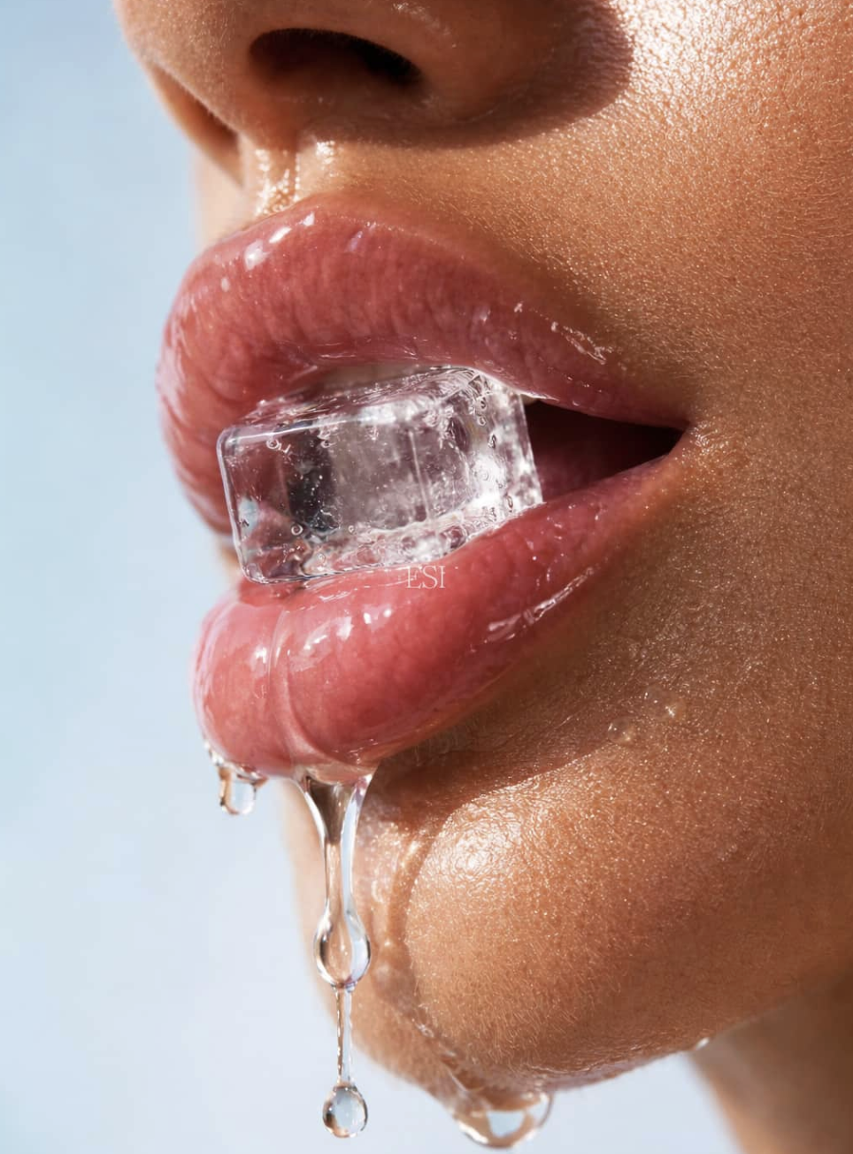
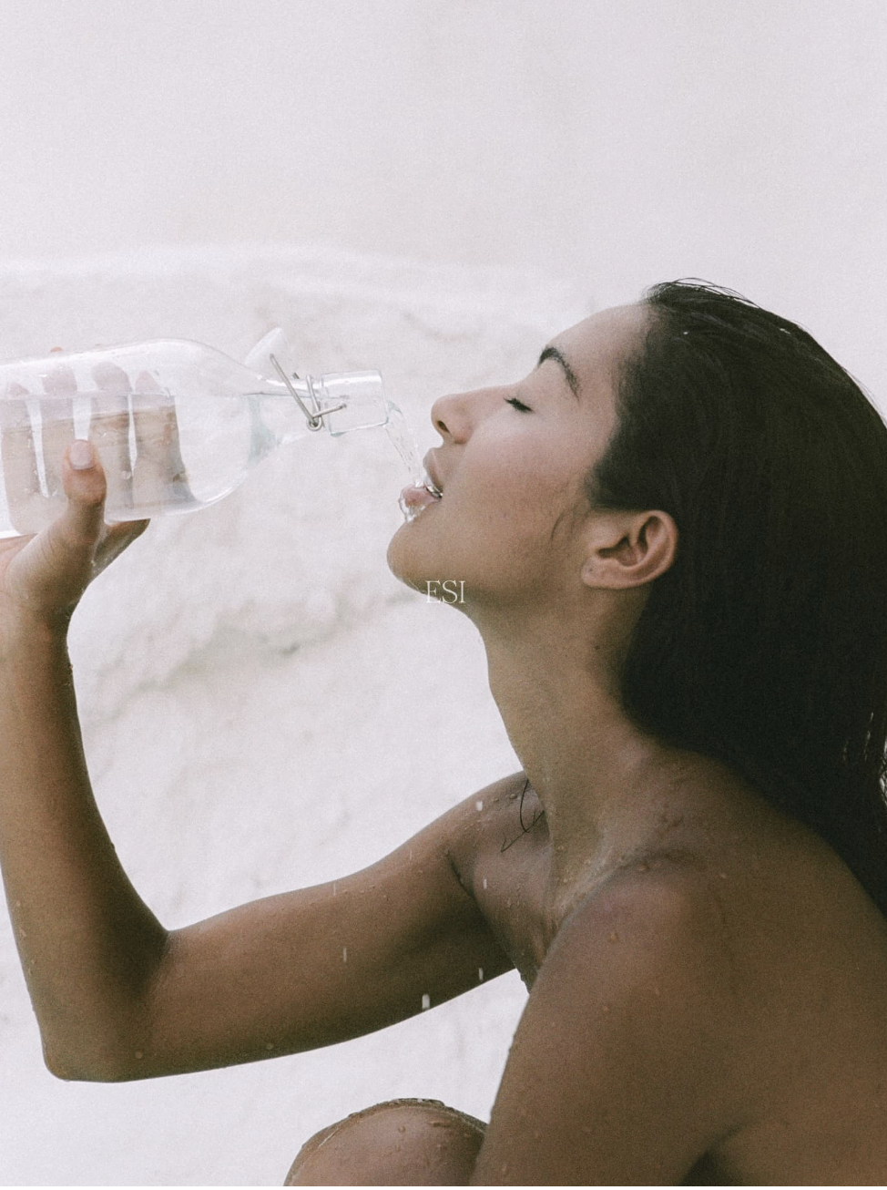
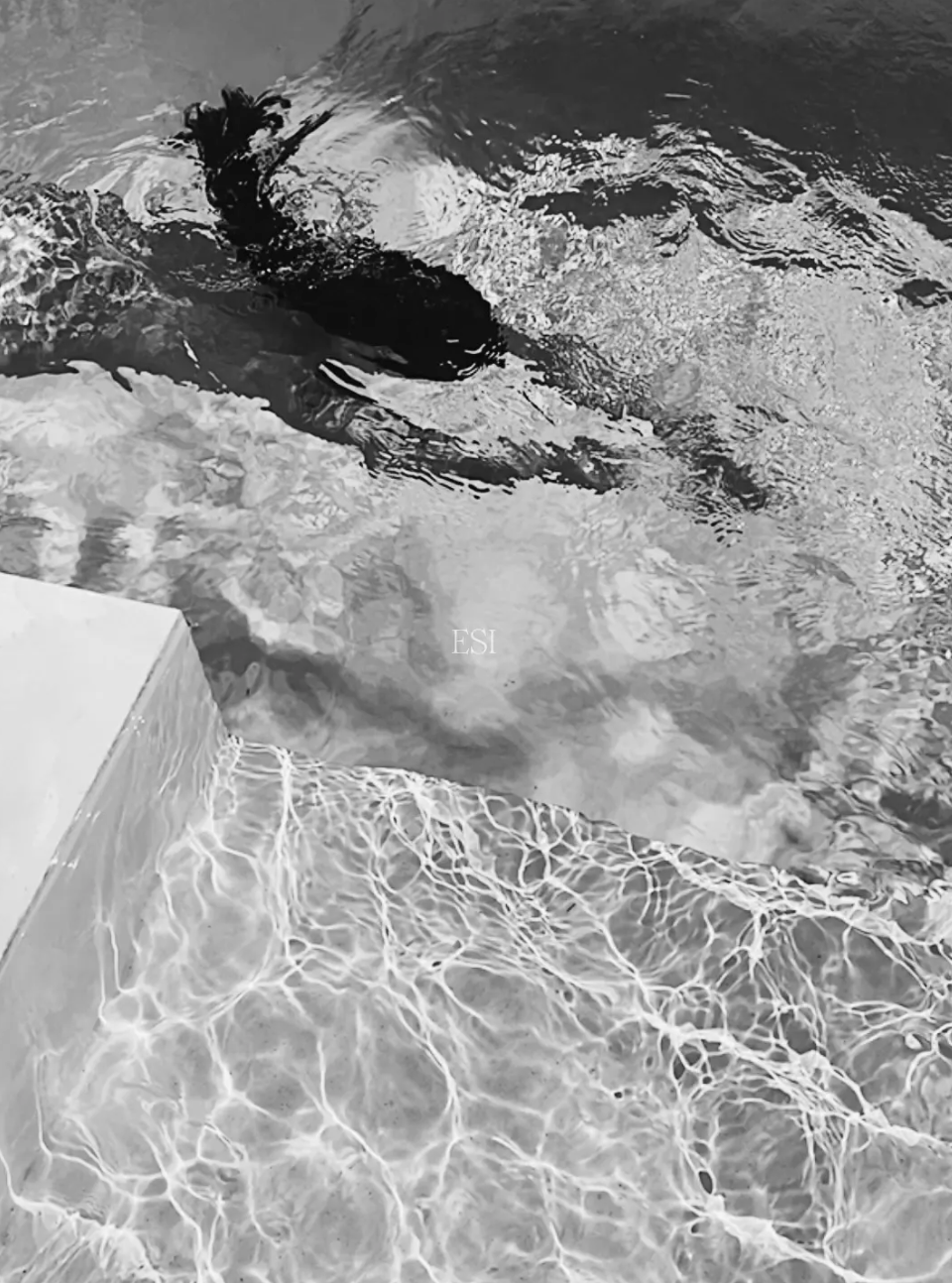
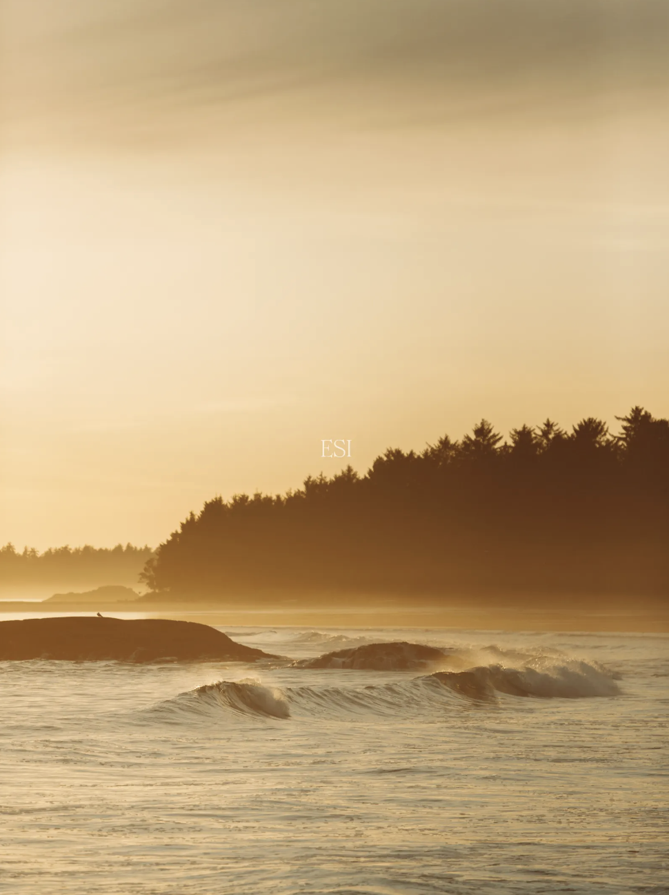
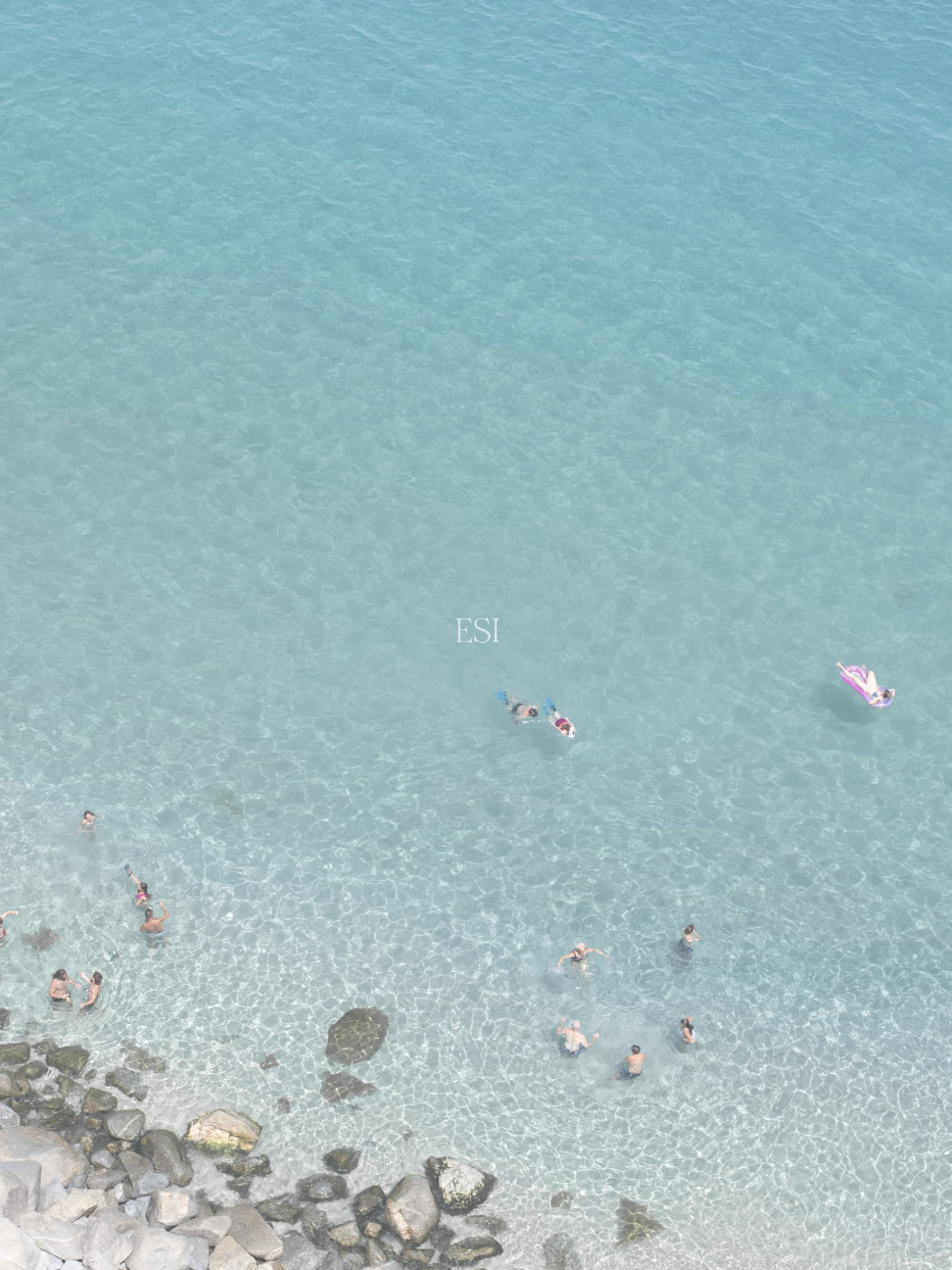
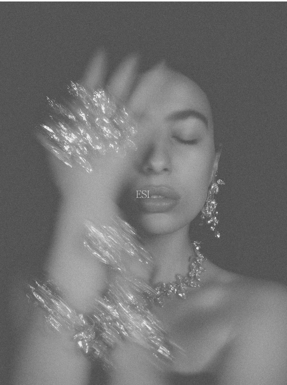
Editorial stock takes a different stance. It leaves space. It suggests rather than explains. Light feels natural. Texture and shadow are intentional. Composition is paced.
This kind of imagery integrates seamlessly into:
Editorial web design
Brand identity systems
Luxury and lifestyle branding
Creative portfolios
It’s designed to live inside systems, not overpower them.
If you’re still neutralizing stock images to make them usable, you’re sourcing from the wrong library.
→ Also Read: Where Designers Actually Find Stock Photos

Why Editorial Imagery Works Better for Modern Branding
Modern branding values restraint, pacing, and clarity.
A single image—well chosen—can do more than a dozen literal visuals. It sets atmosphere and lets the viewer meet the brand halfway.
Editorial stock is especially effective for:
Website hero sections that need atmosphere, not instruction
Long-form content where rhythm matters
Brand mood boards and pitch decks
Social content where tone outweighs information
Instead of asking, “What does this show?” I ask, “What does this suggest?”
That distinction changes everything.
A Cohesive Way to Source Stock Photography
One of the biggest workflow challenges with stock photography is inconsistency. You find one strong image, then struggle to build a system around it.
Editorial-focused libraries solve this through curated collections designed to work together. Similar light. Similar texture. A shared visual point of view.
That cohesion allows imagery to scale across pages, campaigns, and platforms without visual whiplash.
For designers building brand systems, that consistency isn’t aesthetic preference. It’s operational efficiency.
You can explore a curated editorial collection here → [Editorial Stock Images]
(Affiliate note: I only recommend tools I would confidently integrate into client work.)
Stock That Doesn’t Feel Like Stock
The phrase gets used often, but when it’s done right, it’s accurate.
Stock that doesn’t feel like stock isn’t about trickery. It’s about intent. The images are created with the assumption that they’ll live inside real design systems—paired with typography, grids, and editorial layouts.
They’re designed to live inside systems, not overpower them.
That makes them particularly effective for:
Designers building scalable brand systems
Creators producing content consistently
Businesses that want polish without gloss
Instead of screaming for attention, the imagery reinforces credibility.
→ Also Read: 5 Ways to Build Consistent Creative Momentum
When Custom Editorial Content Makes Sense
For launches or highly specific visual directions, even the best library may not be enough.
Custom editorial content can bridge the gap—more tailored than stock, lighter than a full production shoot.
It works well when you need:
Visuals aligned to a specific palette
On-brand imagery without overproduction
Assets designed to integrate into an existing system
Details on custom content options → [Custom Editorial Content]
Ethical Stock Photography and Supporting Creatives
Another reason I pay attention to where imagery comes from is how photographers are treated.
High-volume stock platforms often prioritize speed and scale over artistic voice. Editorial-focused platforms tend to value contributors differently—emphasizing quality, point of view, and fair compensation.
That shows up in the work.
Photographers are incentivized to create images with intention, not just volume. Designers benefit from stronger, more distinctive visuals. And the entire ecosystem feels more sustainable.
Designing With Quiet Luxury in Mind
Quiet luxury isn’t minimalism for its own sake. It’s confidence.
Editorial imagery supports that sensibility. It doesn’t over-explain. It trusts the viewer. Paired with disciplined typography and generous spacing, it reinforces credibility rather than chasing attention.
Stock photography shouldn’t be something you hide.
When curated and system-aware, it becomes part of the architecture—supporting storytelling, reinforcing tone, and making design more cohesive and scalable.
Explore the full collection → [Editorial Stock Images]
Final Thoughts
I no longer think of stock photography as something to hide.
When it’s curated, editorial, and thoughtfully designed, it becomes part of the system—supporting storytelling, reinforcing tone, and making design work more cohesive and scalable.
For designers, creators, and brands building modern, editorial-led identities, the goal isn’t to avoid stock entirely. It’s to choose stock that respects nuance and integrates seamlessly into the work.